Jeff was comparing release points in a single game and seeing how consistent they were. Oddly, in one of Pineiro's worst games, he had the most consistent release point. As Jeff points out, consistency is only a benefit if you're consistenly good. Observers of that game thought Pineiro's release point was consistenly bad.
Still, wouldn't it be great to be able to compare one game to another? That way we could look at the range of release points in two games, and see how they differed. This would confirm an observation that a pitcher's release point was consitently bad for the game.
The trouble is that Jeff's work is based on screenshots from TV broadcasts, in different stadiums with different camera configurations. For example, here are (from his site), the three shots of Pineiro delivering a curveball from the three games Jeff analyzed:
 |  |  |
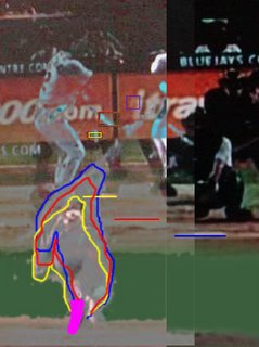
If we try to superimpose these images on top of one another, we can see clearly (from the colored lines I've added to Jeff's release-point box) that in each game, the cameras are positioned and/or aimed differently):

The Magenta area is where Pineiro's back foot appears (having just pushed off the rubber), and is the reference point I used for aligning the three images. Pineiro's body is positioned very similarly in all pictuers (the slight differences in outlines could even be only because of slight differences in the timing of the screen shot). But, as the horizontal line indicates, home plate appears in a much different place for each picture.
Because of these discrepancies in camera angles, the release-point box appears in different places in each picture. That makes comparing game-to-game very difficult, if not impossible. That doesn't make Jeff's analysis less interesting or useful. I'm just showing why taking Jeff's already-difficult work further is problematic.